Another way to do Black & White

Contrast is everything! Contrasting letters works best when keeping the color set on each letter low in contrast so the letters stand out from each other.  If the colors get too busy, the effect is lost.  Nobody wants an illegible monogram cake topper.  Here, not only do the colors offset each other but the fonts do, too.   I love pairing a feminine font with a bold masculine font.
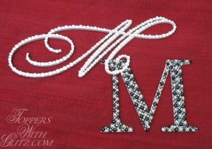
M (Jasmine): Crystal, M (Georgia): Jet, Hematite, Black Diamond

Leave a Reply

Your email address will not be published. Required fields are marked *

You may use these HTML tags and attributes: <a href="" title=""> <abbr title=""> <acronym title=""> <b> <blockquote cite=""> <cite> <code> <del datetime=""> <em> <i> <q cite=""> <strike> <strong>