It’s all about the contrast!

I love working with solids; the cake is brown, the flowers are pink, the topper is gold. That doesn’t mean the topper has to be a solid color.  Would you have guessed that four colors were used on this one?  The topper can be multi-tonal but the idea is to have it appear to be one color from far away by picking shades that are close to one another.  It’s still interesting — the closer you get the more dimension you start to see.
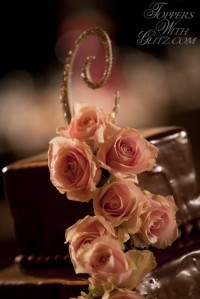
Font: Eileen, Colors: Lt Colorado Topaz, Gold Shadow, Lt Peach, Silk

Leave a Reply

Your email address will not be published. Required fields are marked *

You may use these HTML tags and attributes: <a href="" title=""> <abbr title=""> <acronym title=""> <b> <blockquote cite=""> <cite> <code> <del datetime=""> <em> <i> <q cite=""> <strike> <strong>